Rachey Babey
Wednesday, 27 October 2010
Thursday, 21 October 2010
Thursday, 14 October 2010
Own Photography
The plain background here helps the subject stand out. He is avoiding eye contact with the camera which connotes shyness and vulnerability.
This photo is a long shot as it shows his whole body. He is also avoiding eye contact which connotes shyness, however his stance connotes attitude and coolness.
This photo is also a long shot, because we get her whole body and the background in. This pose connotes fun and happiness. She is looking directly at the camera which connotes confidence.
This photo is a medium long shot. Her hands over her face suggest she is hiding, or she is frightened of something. The photo connotes laughter and fun.
Thursday, 7 October 2010
Questionnaire Results
Questionnaire Results
1) Are you male or female? Male
2) What are your religious beliefs? Catholic
3) Where do you live? Middlesbrough
4) What is your nationality? British
5) What are your interests? Socialising
6) What is your political view? Conservative/ Liberal Democratic
7) What is your preferred genre? Charts/ Pop/ R&B
8) Are you planning on going to University? Yes
9) Would you mind telling us what your parents/guardians do for a living? Various answers.
10) What is your favourite artist/band? Michael Buble.
11) What do you wish to become in the future? Various answers.
12) What are your main goals in life? To be successful.
13) Do you prefer to be in a group or on your own? In a group.
14) What stereotype do you feel you fit? Average
15) Describe your personality? Friendly
16) Who inspires you the most and why? Mostly family members, personal answers.
17) Describe yourself in 3 words? Various different answers.
18) What is your favourite song? Various answers.
19) What song do you feel you relate to? Personal answers.
20) Do you use the same brands when you shop, or do you like change? The same.
My results show that my audience should probably be male, however because I didn’t ask a lot of people, I would like my magazine to be aimed at both males and females. My audience are also mostly Catholics; they also prefer the pop/R&B genre of music. All of my audience want to attend University and they all want to be successful, when producing my magazine I will take all of these points into account.
Audience Questionnaire
1) Are you male or female?
………………………………………………………………………
2) What are your religious beliefs?
……………………………………………………………………....
3) Where do you live?
………………………………………………………………………
4) What is your nationality?
………………………………………………………………………
5) What are your interests?
……………………………………………………………………...
6) What is your political view?
……………………………………………………………………...
7) What is your preferred genre of music?
………………………………………………………………………
8) Are you planning on going to University?
Yes No Not Sure
9) Would you mind telling us what your parents/guardian do for a living?
………………………………………………………………………..
10) Who is your favourite artist/band?
………………………………………………………………………..
11) What do you wish to become in the future?
………………………………………………………………………..
12) What are your main goals in life?
………………………………………………………………………..
13) Do you prefer to be in a group, or on your own?
………………………………………………………………………..
14) What stereotype do you feel you fit?
………………………………………………………………………..
15) Describe your personality.
………………………………………………………………………..
16) Who inspires you the most, and why?
………………………………………………………………………..
17) Describe yourself in 3 words.
………………………………………………………………………..
18) What is your favourite song?
………………………………………………………………………..
19) What song do you feel you relate to?
………………………………………………………………………..
20) Do you use the same brands when you shop, or do you like change?
Example College Magazines - Favourites.
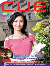
I chose this cover as one of my favourites because it looks professional, they have used a celebrity on the cover. The plugs are also interseting and attracted me to the magazine. She is looking directly at the audience which invites the audience in.
I have chosen this cover as one of my favourites because the magazine looks like a professional magazine. The plugs are relevant to that of a college student, and will attract the intended audience.
I have chosen this cover as one of my favourites because I think the model on the cover looks like a real college student. It doesn't have many plugs like a real magazine, but I think the layout is set out to attract the intended audience.
Monday, 27 September 2010
Subscribe to:
Comments (Atom)


